 In today's class we will begin the following project:
3rd Year object drawing project: Fill an A2 sheet with loads of sketches of your object from different views, using different art materials and layering the images. The end result will be a detailed artwork, which explores the objects qualities. Step 1
Step 2
Step 3
prezi.com/ukhanllef51g/?utm_campaign=share&utm_medium=copy Please click the link above to access today's presentation. The intro for Impressionism relies on the historical context.
On Thursday the 29th we will be starting to work on the modelling section of the Craft paper. You will select from a,b or c and begin to develop your initial research. The craft exam is 5 hours long. Should you select modelling you will need to complete your preliminary sheet along with the unfired sculpture. 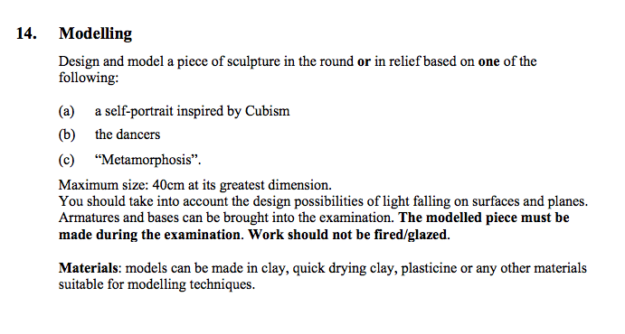 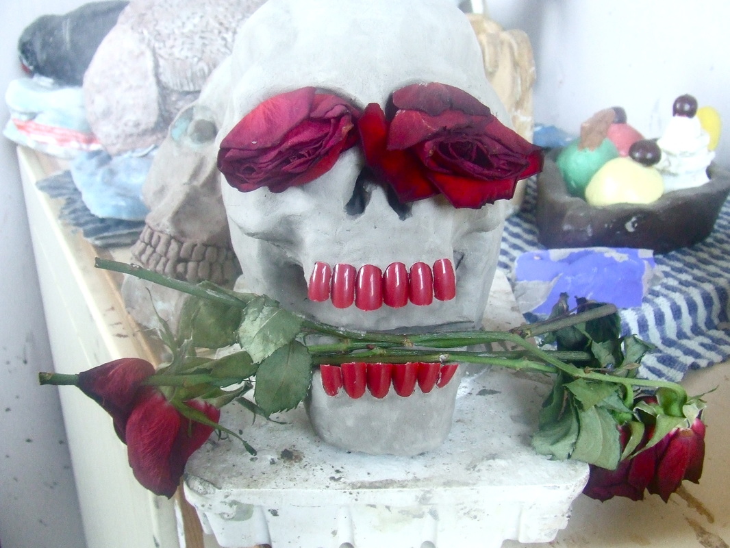  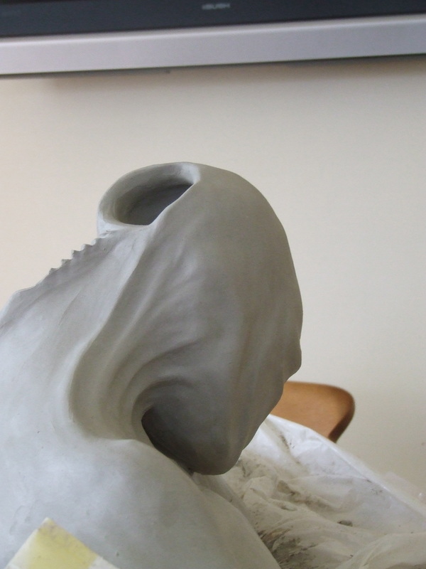 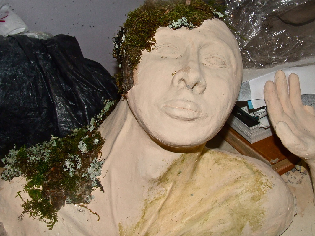 3rd Year Object drawing Select an object from the list below and create 2 sketches as follows:
A large stapler, old boots, light bulb, Portobello mushrooms, avocado, an egg carton with eggs inside or a hammer and nails.  Portraits of Inspirational People: In our life-drawing classes on Wednesdays of each week you will be creating a portrait of someone that you find inspirational. It can be a family member, friend, person of significance or someone famous.
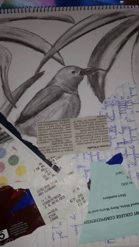
* ground stands for background. We will layer different types of paper on to the white of the cartridge paper. The varied background may suggest using differing materials in your work.   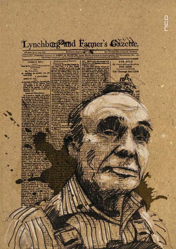 Select one figurative artist's work that inspires you, and use their approach to the figure in your portraits.
-what artistic elements they use -what emotional response you have to the work
  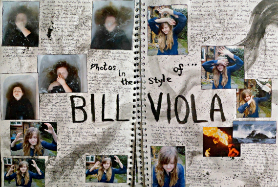  A list of some figurative artists:
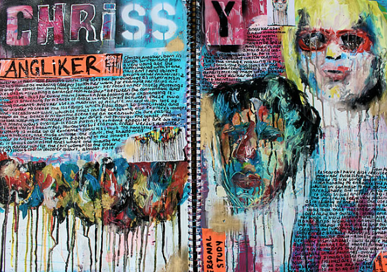
Jenny Saville Francis Bacon Caravaggio Leonardo da Vinci Bill Viola Lucian Freud Frank Auerbach Egon Schiele Frida Kahlo Louis le Brocquy 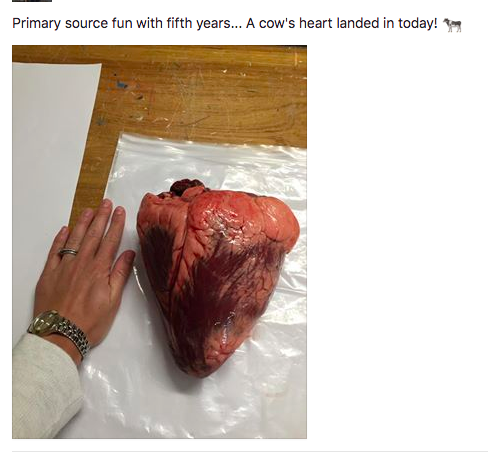 See the above photo for inspiration as to what objects you could bring in. This student brought in a cow's heart for their inspiration.  This is a sample from last year. My student went to the science teacher and photographed the heart. She stitched into the pages to create a visually interesting piece  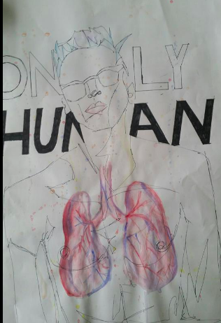 You will need to bring in an object to draw from on Monday 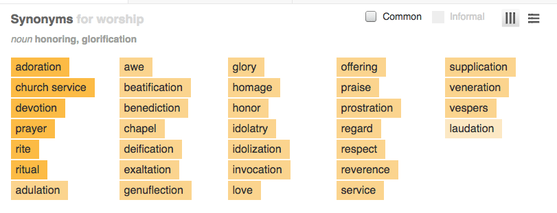 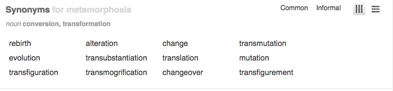 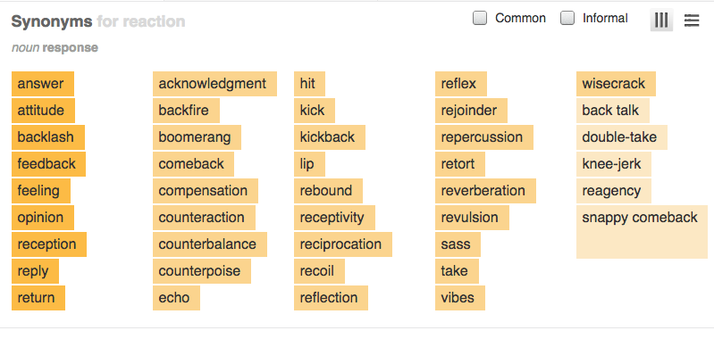  www.pinterest.com/usefulartifacts/ click the link <<<< to access my pinterest account. log in details are username [email protected] password Glitterglue The challenge is to create 3 filled A3 sketchbook pages based on any one of the themes below. There will be a prize for the most inventive and creative project.
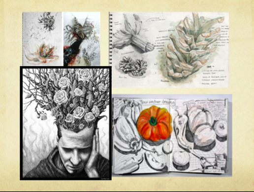
 (Themes are given to allow you, the artist, to explore and research this topic individually. Beinventive and push this theme as far as you can.) You can even stick in leaves, grass, wires, broken computer parts or any materials you find that relates to your work. Be creative and try new materials. Do one or two sketches a night and you'll have this project completed in no time. Best of luck and I cannot wait to see the work! Step 1. Create a visual mind map, in your sketchbook, about your theme to help explore the theme. See the example to the left <<< Step 2. Select an area which you would like to examine and explore through drawing in your sketch pad. Step 3. Start with observational drawings of your chosen area. Use pencils, pens and colour pencils. Fill your pages with loads of drawings of this object. Be creative with this. Step 4. Collect images, photos or images from newspapers and create a collage about your chosen area of investigation. You will have 8 days to complete this challenge. I will collect your sketchbooks on Thursday the 29th. I will select the winner over the weekend. See last years examples below for inspiration.   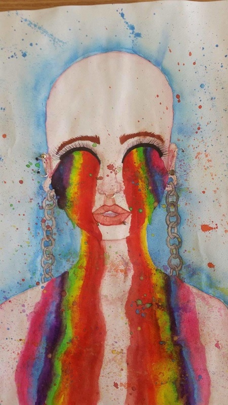 This student used real piercings on her piece. 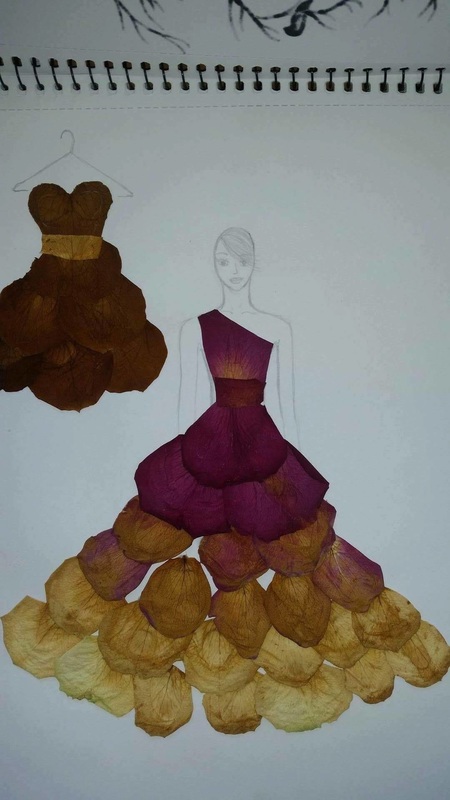 This student used real flower petals www.pinterest.com/usefulartifacts/ click the link <<<< to find my pinterest account. The boards Nature vs. Streetlife, Sketches and Looking at Nature may help inspire your ideas. 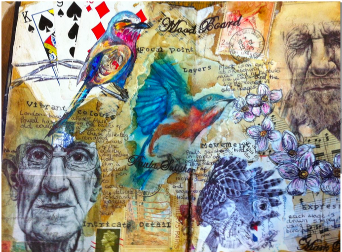
    Assault. Murder. Consorting with the devil. The notorious succès-de-scandale of the 17th century, Michelangelo Merisi da Caravaggio was accused of all of these and more during his tempestuous career. Condemned as the "antichrist of painting,"Caravaggio was as controversial for his revolutionary artworks as he was for his infamous temper and lengthy police record.
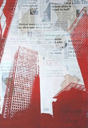
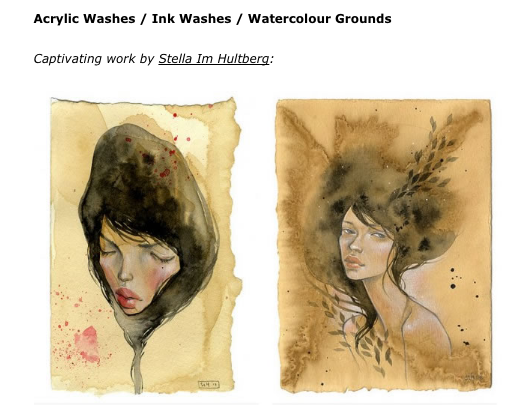
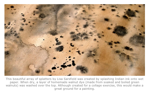
A notorious painter during his life, following his death Caravaggio was largely forgotten and it wasn't until the 20th century that his key role in the development of Western art was remembered. Despite a scandalous lifestyle helping to preserve interest in Caravaggio throughout the centuries, in the end, it is the true genius of his works that has won his place in the history of art as well as in the contemporary imagination. Caravaggio's works constitute some of the most stunning works in the entire history of Western painting. Observing the evolution of his style from his early works (The Fortune Teller, Bacchus and Narcissus) to his major successes (The Calling of Saint Matthew and Doubting Thomas) to his final paintings (David with the Head of Goliath) is like watching the tumultuous ups and downs of his life. Although chiaroscuro was used long before Caravaggio came onto the art scene it was he who defined the technique and darkened the shadows. The artist's observation of physical and psychological reality strengthened his popularity but caused problems with his religious assignments. A prolific artist, Caravaggio worked quickly, using live models and using the end of his brush handle to score basic outlines of his work. His preference for working directly onto the canvas was alien to his peers and they accused him of idealizing his figures. 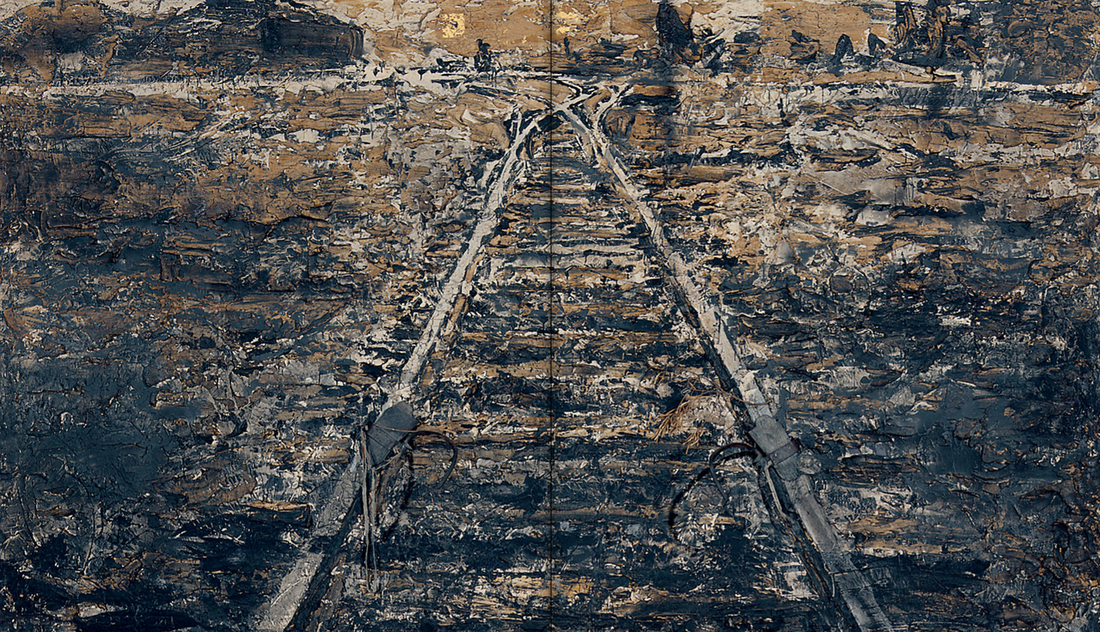 painting.about.com/od/paintingforbeginners/fl/How-to-Paint-More-Loosely-Dos-and-Donts.htm The above website gives you plenty of information about the use of mark-making in painting. Mark-making creates depth and conveys both texture and emotive qualities. Anselm Kiefer The great majority of Kiefer’s works since his emergence in the late 1960s through the 1990s refer to subjects drawn from Germany and its culture: German history, myth, literature, art history, music, philosophy, topography, architecture, and folk customs, even going so far as to exploit clichés or commonplace icons. Either directly or by strong implication, many of these references to German culture and history also evoke the uses and misuses to which the visual and verbal propaganda of the Third Reich subjected them. As Kiefer has said in reference to this national legacy of World War II, “[A]fter the ‘misfortune,’ as we all name it so euphemistically now, people thought that in 1945 we were starting all over again. . . . . It’s nonsense. The past was put under taboo, and to dig it up again generates resistance and disgust.” Homework: Create 2 more grounds for your sketchbooks. Types of grounds: • • • • • • • • • Coffee stain with coffee mug circles Inky wash Ink on wet paper Marbling Acrylic wash Newspaper Splattered paints Paint drips Dry brush colour highlights
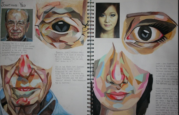
 Many Art students looking to attend art college or apply for visual courses must present a Coursework or Exam portfolio that shows development. Students are sometimes confused about what the term ‘development’ means in this context, and are uncertain about how they should go about achieving this. This article endeavours to answer these questions and provides a process by which students can ensure their work develops sufficiently. This is intended as a broad guide only: If you are told that your work must show development, your teacher is telling you that your work must change a little (both in use of media and composition) from one piece to the next. In other words, an A Level Art Coursework portfolio must tell a visual story: with a starting point, a conclusion, and a journey in between. It is not acceptable, for example, to show the same things drawn or painted from different angles over and over again, or to execute the same composition first in pastel, then in paint, then in charcoal and so on…or to submit paintings of many different items that have no visual or thematic connection to each other. ‘Development’ means systematically working towards better artwork: trialing, refining and exploring compositional devices and technique, demonstrating to the examiners that you have gone through a learning process and arrived at a successful final piece. 1. Select an original, personally relevant, visually complex, readily-available subject or theme that can sustain your interest for a year (see the accompanying guide: how to select a good A Level Art theme); 2. Complete 4-10 drawings of your chosen topic in your Art Sketchbook, using a range of black and white and coloured mediums such as graphite pencil, Indian ink, acrylic, coloured pencil, watercolours, oil. The level of realism achieved in these drawings will be dependent on your own drawing style and preferences. Mix and layer mediums as appropriate. Include photographs if desired. The drawings may be semi-incomplete and can merge into each other. At this point, do not worry so much about what you are achieving in terms of composition. You are merely conducting visual research and exploring your topic. 3. Fill gaps around the drawings with notes discussing your theme / issue / message…why this is personally relevant to you; what appeals to you visually about the subject; how the subject matter might be composed in order to support or convey your ideas. Look carefully at what you have drawn and make notes about how the visual elements (line, tone, texture, space, colour etc) interact… For example, are there strong contrasts between highly detailed areas and sparse areas? Are the negative spaces as interesting as the objects themselves? Are there repetitions of certain shapes and colours? Are you exploring frames within frames? …In essence, establish what you are dealing with visually. 4. Select an artist model whose work relates to your subject matter and inspires you. Research this artist. Complete several pages in your Art Sketchbook, including composition studies, imitations and pastiches of their artwork, using a range of mediums. Fill spaces around the illustrations with notes explaining/discussing their technique/s (mark-making methods); use of media / materials; style; composition (i.e. the relationship between the visual elements: line, shape, colour, tone, texture and space. Discuss how these elements form ‘visual devices’ that ‘draw attention’, ‘emphasise’, ‘balance’, ‘link’ or ‘direct the viewer through the artwork’ and so on). Write notes about the ideas, moods and subjects explored within the drawings and how all of the above relates to your topic or theme. Your comments should show evidence that you have researched your artist (using proper terminology) and should also contain your own thoughts and responses. Under no circumstances should it appear as if you are just regurgitating information from a textbook. Learn from this artist and establish how this artist is relevant / useful for your own project; 5. Complete 10 – 15 drawings and paintings that show a smooth transition from your original artworks to images that are influenced by your first artist model. Do not leap in and copy everything the artist does. It may be, for example, that you simply copy the way a particular artist uses foreground, mid-ground and background, or the way in which they apply paint onto a scratched, irregular surface. The purpose of this exercise is to learn particular techniques or compositional strategies – not to copy their work in its entirety. The result should be a series of paintings which show gradual changes and exploration. After each one you should have a discussion with your teacher about what you can do next to help convey your ideas more successfully. Nikau began her A2 Painting Coursework by selecting the topic of junk food, focusing in particular on the excessive consumption of junk food by young people and the health risks that are linked to the consumption of additive-laden, calorie-rich products. Nikau’s initial sketchbook pages (visible in the video at the bottom of this post) are filled with notes and drawings exploring this theme. These include mixed media drawings of junk food items and children as well as an analysis of the visual potential of her theme. Here, Nikau clarified her ideas and established the ‘starting point’ of her project. Following this, Nikau analysed the artwork of Janet Fish. Nikau was drawn to her paintings of bright, reflective surfaces (something that would be particularly helpful when painting glossy, seductive junk food packaging) and for her ability to create busy, vibrant works that are successful, despite an overload of sensory information. Nikau completed diagrammatic sketches of compositional structure and imitated parts of paintings by Janet Fish, as in the sketchbook page shown above (note that copying parts of an artwork is often all that is needed for a student to gain an understanding of technique…slavishly copying an entire work wastes precious time; note also the use of ‘I’ within the text and the inclusion of personal viewpoints and opinions, linking of comments to her own project – this reassures the examiner that the writing is the student’s own and is not simply copied from a textbook). 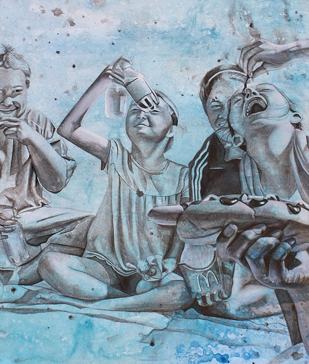 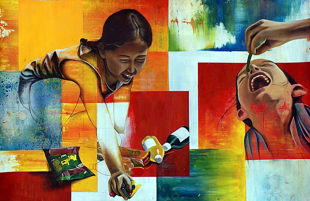 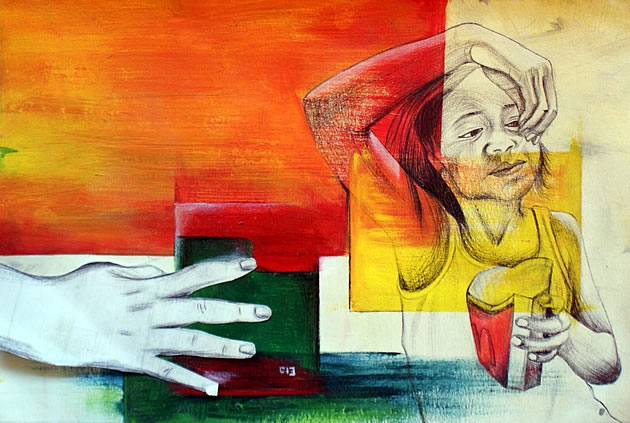 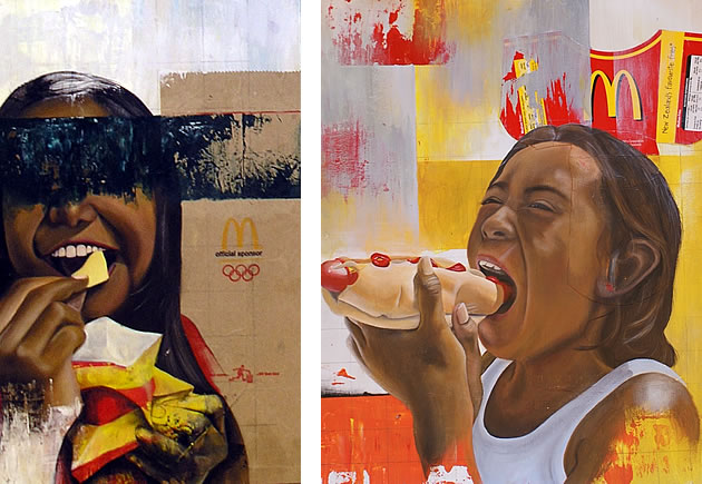 Due date: 22nd Sept Draw a self-portrait wearing sunglasses and the reflections in the glasses should be based on your favourite movie/series/ TV Show or Book. You can work directly from a mirror or photograph, save to you Ipad or print photo out . This exercise focuses on both portraiture and still life combined. It has to be done A4 size in your sketchbook, you can use a combination of both colour & pencil, charcoal, paint, whatever medium you feel is suitable for your creation. 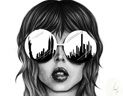  Please find attached a powerpoint suggesting the kind of close-up detail you can achieve in your observational sketches of your chosen objects
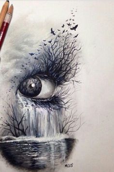
6th Year art homework due 21/9/16 Metamorphosis Turn life-drawings into objects in 4/5 steps. You can use any detail of human anatomy and manipulate it into household objects. See the examples below. This challenge incorporates both the life-drawing and still life projects into one imaginative piece. Try to be inventive. 1 sketchbook page  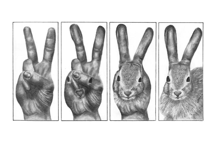  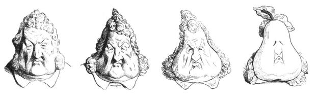 Use these images as inspiration and try to see what basic shapes or elements comprise the objects that you're looking at. For example the stomach of a pregnant women is rounded like a circle. The bump could represent time and you could turn her figure into an open pocket watch in 4/5 steps. Email me if you're having difficulty.
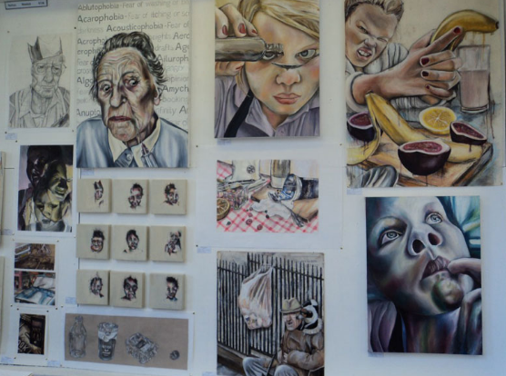
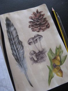
www.pinterest.com/sashton29/metamorphosis/ This pinterest board is based on Metamorphosis and may help inform your work. Hi and welcome to the new 3rd year page. Click the following link to access the assigned work and new posts related to your project 3rd Year Please visit my Pinterest account for further help when developing your work www.pinterest.com/usefulartifacts/ Here are some examples of past pupils' work. Remember that if you tackle the project in small chunks at a time it is very manageable. If you have any concerns about the work you can email me via the Contact page  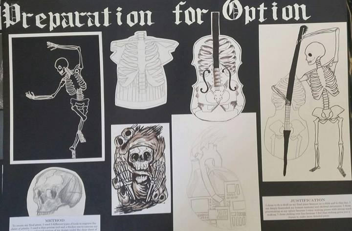 Our weekly life drawing class allows us to practice one of the most difficult areas in the subject. Proportion and the axis of the body is key. I will include videos weekly to assist in your artistic development. Subscribe to Alphonso Dunn on youtube to practice and develop your style. click the following link to find his work www.youtube.com/channel/UCoBapgfK_m6G7airg1rdn8w  6th year sketchbook challenge: Select either a phobia or draw a portrait with a reflection in a pair of sunglasses www.fearof.net/ Draw a self portrait wearing sunglasses and the reflections in the glasses should be based on your favourite movie/series/ TV Show or Book. You can work directly from a mirror or photograph, save to you Ipad or print photo out . This exercise focuses on both portraiture and still life combined. It has to be done on A3 size paper, you can use a combination of both colour & pencil, charcoal, paint, whatever medium you feel is suitable for your creation.  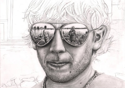  1st year art: We will be moving onto life drawing this week. We will start with feature drawing and then build towards a self-portrait. See below the video from today to help draw the basic eye shape. Remember that everyone has a different method and if this doesn't suit your style then you don't have to use it. KEEP IT LIGHT UNTILL YOU GET IT RIGHT.  In class we will be creating a2 detailed drawings of your shoes and including a detailed close up box. 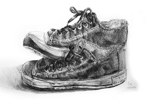 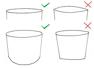 How to Create an excellent Observational Drawing: September 2, 2015 by Amiria Robinson Observational drawing is an integral component of many high school Art courses, including GCSE/IGCSE and A Level Art. Often, drawing is the core method of researching, investigating, developing and communicating ideas. While it is accepted that there are many wondrous types of drawings – and that non-representational drawing methods have an important role in student Art projects – it is usually advantageous to demonstrate competent, realistic observational drawing skills to the examiner (particularly in the early stage of a project). What follows is a list of tips that have been written specifically for high school art students who are looking to improve the realism of their observational drawings. It is for those who have already selected something appropriate to draw (see this guide for selecting subject matter if you need help with this) and who understand how to compose a drawing well (this will be covered in a subsequent article). Tip 1: Look at what you are drawing Failing to look at what you are drawing is one of the most fundamental errors an Art student can makeFailing to look at what you are drawing is one of the most fundamental errors an Art student can make This sounds obvious, but it is the most common error made by art students. Many students attempt to draw things the way that they think they should look, rather than the way they actually do look. The only way to record shape, proportion and detail accurately is to look at the source of information. Human memory does not suffice. Forms, shadows and details are hard enough to replicate when they are right there in front of you; if you have to make them up, they appear even less convincing. In order to produce an outstanding observational drawing, you must observe: your eyes must continually dance from the piece of paper to the object and back again. Not just once or twice, but constantly. Note: even if you pursue a theme about mythical creatures, fairy tales or some other imaginary form, you should work as much as possible from observation. Piece your creatures together from fragments of life. Dress people up and then draw them or merge different parts of insects or creatures together (using artistic license as appropriate) rather than creating an entire form or scene from your head. Tip 2: Draw from real objects whenever possible Drawing from observation: forks tied with string. This superb observational drawing exercise is one set by artist and teacher Julie Douglas.The phrase ‘observational drawing’ typically implies drawing from life (see the superb observational drawing exercise set by artist and teacher Julie Douglas). Ask any art teacher and they will list the benefits of drawing from objects that are sitting directly in front of you. You are provided with a wealth of visual information…changing light conditions; rich textures; views of the subject from alternate angles; as well as information from other sense…smells and noise from the surroundings etc. Transcribing from three-dimensions to two is ultimately much harder than drawing from a photograph, but it often results in drawings that are ‘richer’ and more authentic. (This doesn’t mean, however, that you should never draw from photographs. Students frequently traipse from home to school and back again: it can be impractical to carry and set up complex still life arrangements over and over again. Some subjects – such as landscapes and nude models – are also unavailable in most classroom settings. It can therefore be good practise to set up a still life arrangement in the flesh (or visit a location) and begin drawing directly from the subject, using photographs to complete the work at home). Tip 3: Don’t trace Throughout history, great realist painters have traced from photographs or worked from projections blown up onto walls. But these painters are not high school art students; nor are they assessed on their ability to replicate form. There is a place for tracing in IGCSE or A Level Art (such as when tracing over something you have already drawn or creating a repeat pattern), but tracing from photographs and then simply applying colour or tone is not acceptable. Such methods of ‘drawing’ involve minimal skill, teach you little and run the risk of producing clunky, soul-less outlines. Don’t do it. Tip 4: Understand perspective As objects get further away they appear smaller. The replication of this change of scale on paper (through the use of vanishing points) is called ‘perspective’. The fundamentals of perspective are usually taught in junior high school; by Year 10 at the latest. If you are a senior art student and have somehow missed this lesson, remedy this situation urgently. There are not many theoretical aspects of art that are essential to learn, but this is one of them. Please view the perspective handouts in the Student Art Guide free teacher resources to get you started. Tip 5. Use grids, guidelines or rough forms to get the proportions right before you add details Many students start with a tiny detail (the eye on a face, for example) and then gradually add in the rest of the image…ending up with a drawing that is badly proportioned or doesn’t fit on the page (or floats aimlessly in the middle of it). This can be avoided by approximating the basic forms before adding details or by using guidelines to ensure that proportions are correct. If working from a photograph, using a grid can result in highly accurate work. It allows students to focus on one small segment of the image at a time and gives arbitrary lines from which distances can be gauged. This can be a helpful strategy when precise, detailed images are required and can itself become a celebrated component in an artwork. As gridding is methodical and involves meticulous plotting of lines, however, it is important to acknowledge that this approach runs the risk of producing tight and regimented drawings that lack in ‘spirit’ and should thus be approached with care. A grid was helpful to create this graphite drawing of dog and cat (which was compiled from two separate photographs). This is by me, Amiria Robinson.If working from life, roughly sketching outlines of the major forms will allow you to get the proportions right, before you add the details. While you do this, you should constantly check which points line up (i.e. edge of nostrils lining up with edge of eye) and the size of every object should be estimated in relation to the things that are beside it. You must get used to seeing things not in terms of absolute scale, but in terms of how one thing compares to another. An initial observational drawing by artist Douglas Flynt: This shows the first stage in an observational drawing (which later becomes a painting) by artist Douglas Flynt. Basic forms are carefully mapped out, ensuring proportions are correct. Tip 6: Be wary of ellipses This diagram by Rachel Shirley illustrates some of the common errors when drawing an ellipse.Ellipses – the oval shapes that are visible at the top of cylindrical objects such as bottles or jars – frequently ‘trip up’ a weak drawer. They can send an immediate signal that a student isnot looking at what they are drawing. All ellipses, no matter what angle they are viewed from, should be rounded (not pointed) at the ends, as illustrated in the image to the left (by Rachel Shirley) and below (sourced from IDsketching). These are photographs of a glass with horizontal bands of tape around it (sourced from IDsketching). These photos provide a superb illustration of how ellipses – when viewed from any angle – are rounded (as opposed to pointed) at the ends. Tip 7: Keep the outlines light This observational study was part of an IGCSE ‘A’ grade Coursework submission by Georgia Shattky, from ACG Parnell College. It shows folded fabric hanging over the corner of a wooden dresser. Note that there is not a single black outline within the work: edges are defined solely through variation in tone.As your drawing is fleshed out in more detail, with attention given to the subtle variations in shape and form, the natural inclination – especially of the novice drawer – is to want to darken in the outlines, to help ensure they are visible. Do not do this. Real objects do not have dark lines running around every edge. Edges should instead be defined by a change in tone and/or colour, as in the beautiful graphite drawing by an IGCSE Art student shown to the left. If you are producing a line drawing, a cartoon or some other graphic image, outlines may be darkened, but in an observational drawing – especially one which you wish to be realistic – dark outlines are never advised. Tip 8: Have a Good Range of Tone When it comes to applying tone to your drawing, as with everything else, look at the object. Observe where the light and dark areas are and copy what you see. In almost all cases, your drawing should have a full range of tone, from black, through a multitude of greys (or coloured mid-tones) through to white. Some students – having learnt how to blend tone smoothly from dark to light – develop the unfortunate habit of randomly shading all surfaces from dark to light. Tone should never be invented and it should never be applied by guesswork. This ‘A’ grade IGCSE Art exam piece is by Caitlin Dykes from ACG Parnell College. Even when a light material is depicted (as in the cloth shown underneath the fruit) shadows are deep and rich in tone. Note the great addition of the snails in this work! Tip 9: Use mark-making to convey surface quality and textureWhen producing an observational drawing, the mark-making used should help to convey the texture(s) of the subject matter. There are a multitude of different ways a pencil can strike paper – hatching / dashes / smudges / dots… think carefully before you decide which technique to use. This ‘A’ grade IGCSE Art exam final piece was produced by the talented Claire Mitchell (ACG Strathallan College). The surface qualities of the objects are skilfully depicted: furled cauliflower leaves, with the finely textured mottled surface of the cauliflower. Tip 10: Include / omit detail as necessaryOne area where students often become disheartened is in the depiction of incredibly complex subjects. When drawing trees, plants and bushes, it is not necessary to replicate every leaf or stick. When drawing a person, it is not necessary to depict every strand of hair. The artist is always in a position to pick and choose what goes in their artwork. As long as the decision is based on what is aesthetically best for the work (rather than wanting to leave out something that is hard to draw…which is often the driving force behind students wanting to eliminate certain aspects of their image) there is nothing wrong with omitting certain details from a drawing. In fact, often the composition is less cluttered and easy on the eye because of it. There are many approaches to this. Sometimes every single detail might be recorded with accuracy. Sometimes a certain area of a drawing is rendered in full, with other parts trailing away. This observational pencil drawing of a sandal, cloth, shoe polish, brush and newspaper was completed during an IGCSE Art examination by Emma Phillips from ACG Strathallan College. This A* work is a good example of how it is sometimes beneficial to omit detail. Emma has included only part of the text, ensuring that her final work doesn’t become over-cluttered. Tip 11: Insert your own soulMost of the tips above are aimed at helping a student create more realistic observational drawings. This last tip is something different. It is a reminder that sometimes it is the difference between the real item and the drawing that matters. Although observational drawings are usually expected to be realistic in nature, they do not need to be hyper-realistic (in other words, they don’t have to look exactly like a photograph). Often, it is the unrealistic parts: the unexpected mark-making – the gap between the real object and what is drawn – where the soul sneaks in. It is the beauty in smudges and irregularities and artistic interpretation. Even an IGCSE or A Level Art student is an artist. Embrace this! A beautiful graphite drawing by April Coppini: This beautiful graphite drawing by April Coppini is a perfect illustration of how an artist can inject some soul into an observational work. While forms are depicted in a realistic, highly accurate manner, they are surrounded and sometimes covered by smudgy, beautiful marks that are only visible in the eye of the artist. This is where the magic lies.If you enjoyed this article, you may also like read the Student Art Guide series aboutcreative use of media, which provides tips and advice for students who are wishing to make their drawings, paintings or sketchbook presentation more exciting. Pinterest29kFacebook476Twitter The sketchbook challenge is to select one of the following themes Biological Worship Reactions Metamorphosis Create 2 A3 pages filled with drawing of your object or imaginative work  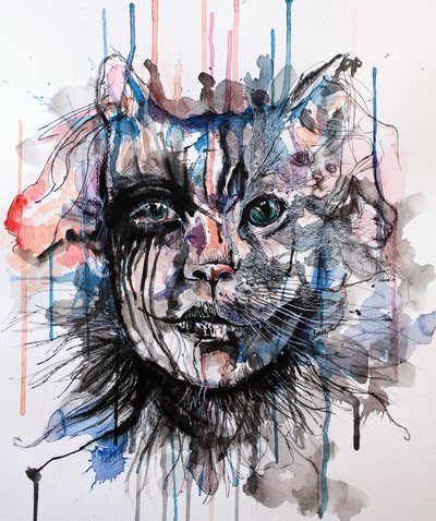 Hi all, this will be the new method in which I give homework. This will allow you, the student, to access tutorial videos and practice your artwork under this pages guidance.
|
Ms O'ReillyArt teacher Archives
January 2019
|
|||||||||||||||||


 RSS Feed
