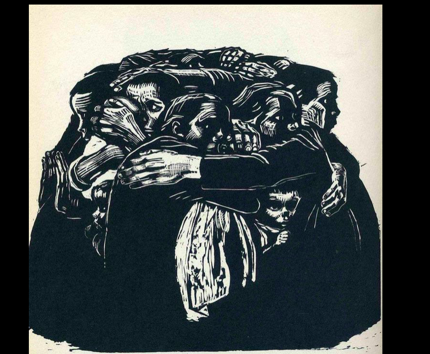
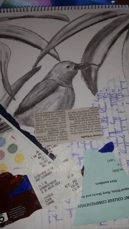
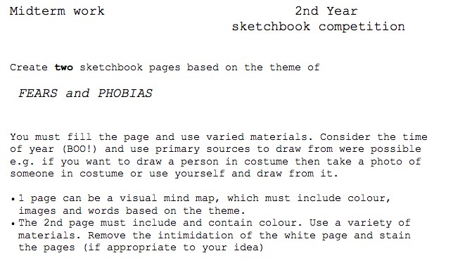
  Today: We will work on altering and changing your design for lino design. See the image below which I changed to work with lino design 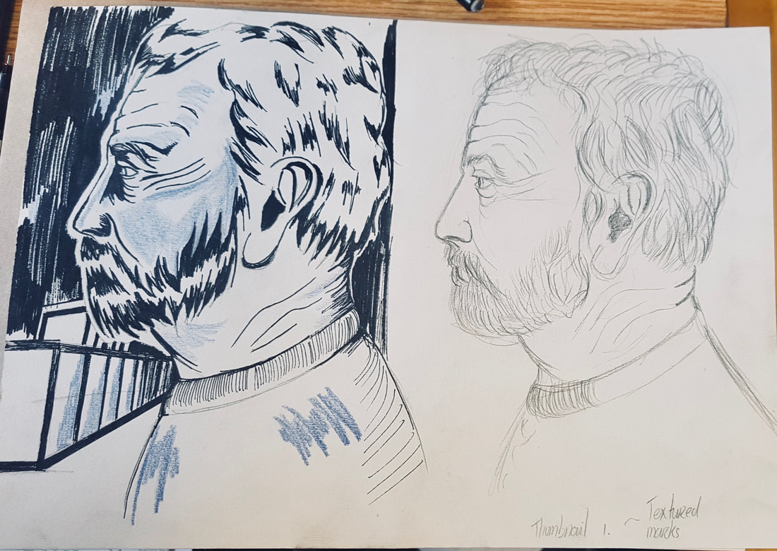 Below are the objects you will need to bring in for your Christmas exam 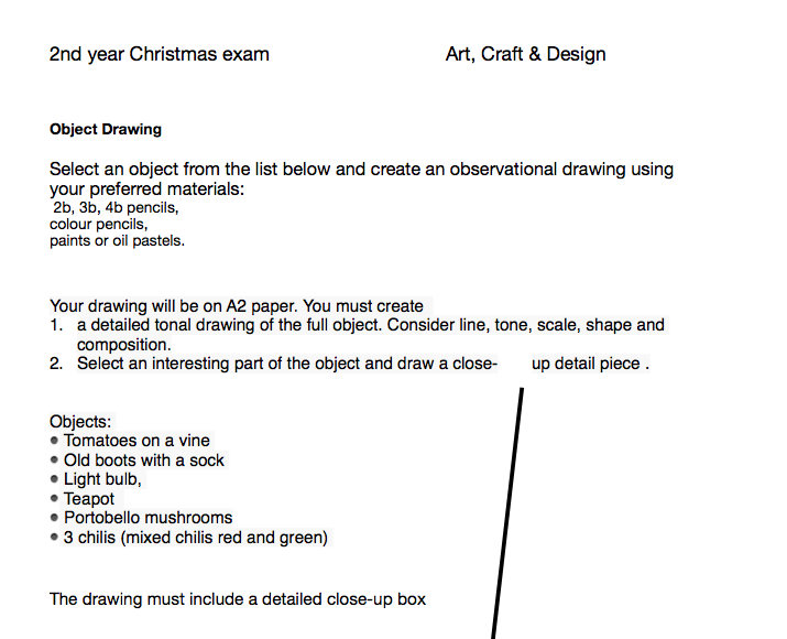 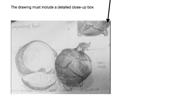 Homework: Take either a self-portrait or picture of someone inspirational. Print it out in black and white to be turned into a painting using Tint and Shade.     
Tuesday 12th Select one of the Still Life paintings below and create your own version of the painting in your sketchpad.
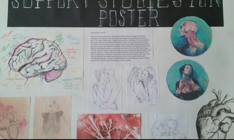
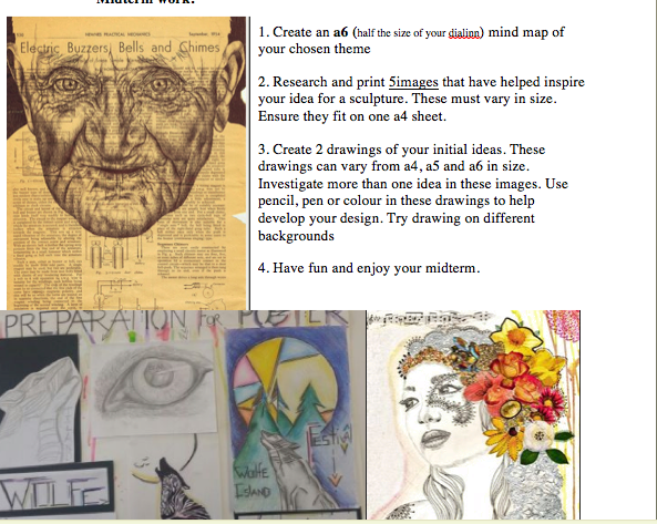
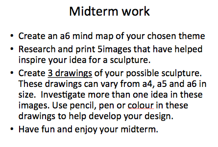
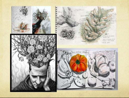
         Support Studies are to be submitted on Tuesday the 28th for you sculpture project. If you need to print images for this sheet you must email them to me before Tuesday's class and provide a note.Below is an example of a Support Studies sheet for Poster Design. It has
 We will be moving on to creating and finishing the sketches for your Preparatory Sheet for 3D 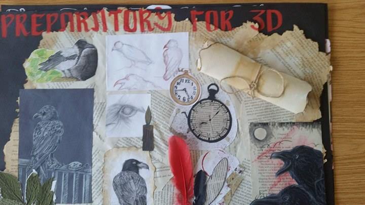 Above is a completed Preparatory Sheet for 3D. It has pencil, chalk pastels, paint, mixed media and collage on one sheet. These sheets allow you to show off your abilities to the examiner next year.
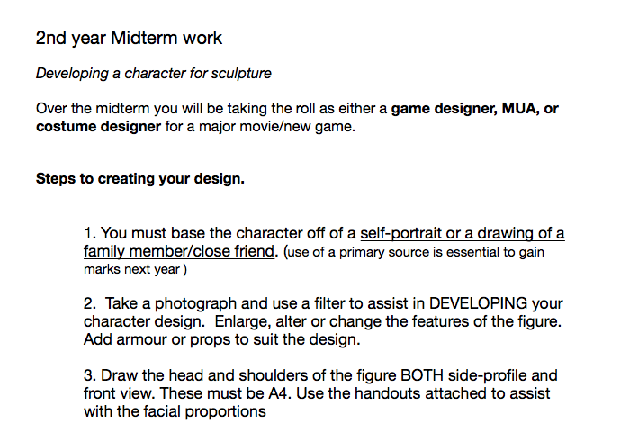
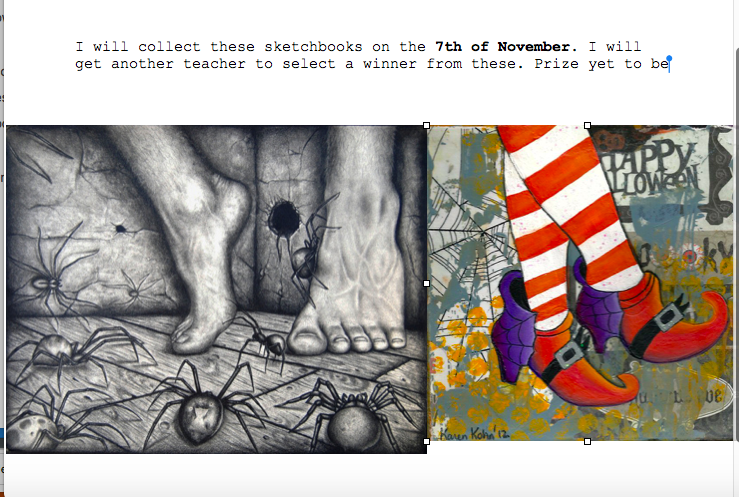
DETAIL! your sketches need to be based on primary source images! If you're making a sculpture of a tree then draw from a real tree. If you are making a sculpture of a dog then photograph a dog and draw it! 2nd Year Homework 15 th November Select 1 sculptural artist from the below list or from your own research and:
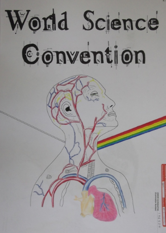
Claus Oldenburg Nick Mackman Debra Fritts Kate MacDowell Sam Jinks Chris Ryniak Yoshitomo Nara Ron Mueck Bruno Catalano Sample appreciation piece: The artist who inspired my design and connected to my chosen theme is Alberto Giacometti. Alberto Giacometti was born in 1901 in the mountain hamlet of Borgonovo, in eastern Switzerland. His work was greatly informed by the World Wars during his life. He created elongated human figures alone in the world and failing to communicate with their fellow man. The figures are roughly finished and worn. His work connects to my theme of exploration because he explores people’s feelings of the time. He makes them thin and beaten to show their sorrow. I original chose this theme as I wanted to explore human emotions but I have now decided to focus on how exploration broadens our minds and makes us happier. 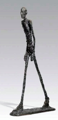 . Select one of the following as the theme for your sculpture : •Selfies & self •Exploration •The Natural World You will be creating a 'figurative' sculpture on one of the themes. We will be using clay and mixed media to complete these sculptures. You will be making a SUPPORT STUDIES SHEET and a PREPARATORY SHEET for your design. This is a practice run for your Junior Cert next year. Homework:
Password: Glitterglue
In today's class we will be completing your 1/2 face portrait for Halloween. Well done on all the good work! You have covered:
Our new project: A mini sculpture project based on the Junior Certificate. 
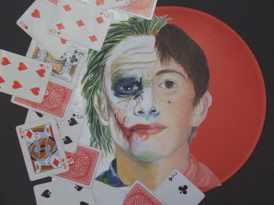 In yesterday's class we divided your photos using the proportional guidelines for the face and started to draw the basic outline of the head and marked in where the features are positioned on the face. STAY AWAY FROM DETAIL at this point. If you make a mistake it is easily fixable at this point. Things to consider for Thursday class:
www.pinterest.com/usefulartifacts/two-face/  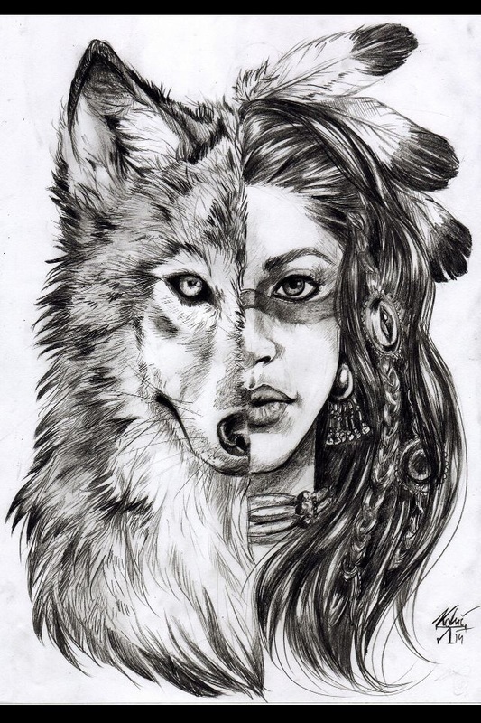  Homework: Bring in an image you can incorporate into 1/2 or less of the face. It could be an animal pattern, animal feature, comic book character, villain's face or your favourite celebrity etc.
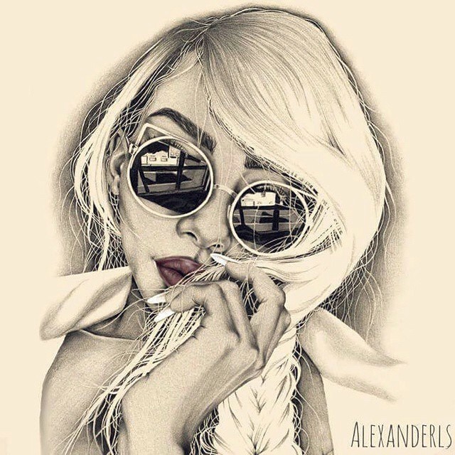
You will incorporate this image into your self portrait. In today's class we took photos for your self-portrait and began to draw using mirrors. For homework: Complete an a4 self-portrait wearing sunglasses. Include your favourite tv show, movie, book or hobby in the reflection of the glasses. The portrait can be completed using pencil or charcoal but you can use colour or different materials for the sunglasses. Due the 8th November
 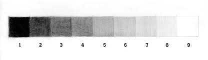 Use a variation of tone to make the drawing look 3d. Work from light to dark and build your tone gradually.
HINT - Take a photo of yourself and alter the contrast on this picture to help see the different tones. www.pinterest.com/usefulartifacts/ click the link <<<< to find my pinterest account. The boards Nature vs. Streetlife, Sketches and Looking at Nature may help inspire your ideas. 
     In class we will be creating a2 detailed drawings of your shoes and including a detailed close up box. 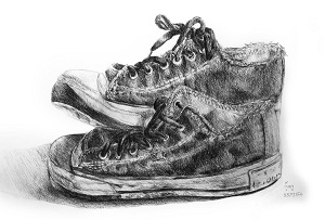 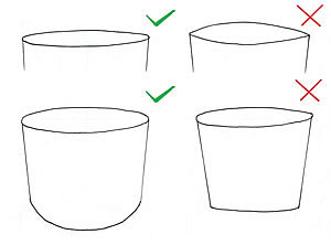 How to Create an excellent Observational Drawing: September 2, 2015 by Amiria Robinson Observational drawing is an integral component of many high school Art courses, including GCSE/IGCSE and A Level Art. Often, drawing is the core method of researching, investigating, developing and communicating ideas. While it is accepted that there are many wondrous types of drawings – and that non-representational drawing methods have an important role in student Art projects – it is usually advantageous to demonstrate competent, realistic observational drawing skills to the examiner (particularly in the early stage of a project). What follows is a list of tips that have been written specifically for high school art students who are looking to improve the realism of their observational drawings. It is for those who have already selected something appropriate to draw (see this guide for selecting subject matter if you need help with this) and who understand how to compose a drawing well (this will be covered in a subsequent article). Tip 1: Look at what you are drawing Failing to look at what you are drawing is one of the most fundamental errors an Art student can makeFailing to look at what you are drawing is one of the most fundamental errors an Art student can make This sounds obvious, but it is the most common error made by art students. Many students attempt to draw things the way that they think they should look, rather than the way they actually do look. The only way to record shape, proportion and detail accurately is to look at the source of information. Human memory does not suffice. Forms, shadows and details are hard enough to replicate when they are right there in front of you; if you have to make them up, they appear even less convincing. In order to produce an outstanding observational drawing, you must observe: your eyes must continually dance from the piece of paper to the object and back again. Not just once or twice, but constantly. Note: even if you pursue a theme about mythical creatures, fairy tales or some other imaginary form, you should work as much as possible from observation. Piece your creatures together from fragments of life. Dress people up and then draw them or merge different parts of insects or creatures together (using artistic license as appropriate) rather than creating an entire form or scene from your head. Tip 2: Draw from real objects whenever possible Drawing from observation: forks tied with string. This superb observational drawing exercise is one set by artist and teacher Julie Douglas.The phrase ‘observational drawing’ typically implies drawing from life (see the superb observational drawing exercise set by artist and teacher Julie Douglas). Ask any art teacher and they will list the benefits of drawing from objects that are sitting directly in front of you. You are provided with a wealth of visual information…changing light conditions; rich textures; views of the subject from alternate angles; as well as information from other sense…smells and noise from the surroundings etc. Transcribing from three-dimensions to two is ultimately much harder than drawing from a photograph, but it often results in drawings that are ‘richer’ and more authentic. (This doesn’t mean, however, that you should never draw from photographs. Students frequently traipse from home to school and back again: it can be impractical to carry and set up complex still life arrangements over and over again. Some subjects – such as landscapes and nude models – are also unavailable in most classroom settings. It can therefore be good practise to set up a still life arrangement in the flesh (or visit a location) and begin drawing directly from the subject, using photographs to complete the work at home). Tip 3: Don’t trace Throughout history, great realist painters have traced from photographs or worked from projections blown up onto walls. But these painters are not high school art students; nor are they assessed on their ability to replicate form. There is a place for tracing in IGCSE or A Level Art (such as when tracing over something you have already drawn or creating a repeat pattern), but tracing from photographs and then simply applying colour or tone is not acceptable. Such methods of ‘drawing’ involve minimal skill, teach you little and run the risk of producing clunky, soul-less outlines. Don’t do it. Tip 4: Understand perspective As objects get further away they appear smaller. The replication of this change of scale on paper (through the use of vanishing points) is called ‘perspective’. The fundamentals of perspective are usually taught in junior high school; by Year 10 at the latest. If you are a senior art student and have somehow missed this lesson, remedy this situation urgently. There are not many theoretical aspects of art that are essential to learn, but this is one of them. Please view the perspective handouts in the Student Art Guide free teacher resources to get you started. Tip 5. Use grids, guidelines or rough forms to get the proportions right before you add details Many students start with a tiny detail (the eye on a face, for example) and then gradually add in the rest of the image…ending up with a drawing that is badly proportioned or doesn’t fit on the page (or floats aimlessly in the middle of it). This can be avoided by approximating the basic forms before adding details or by using guidelines to ensure that proportions are correct. If working from a photograph, using a grid can result in highly accurate work. It allows students to focus on one small segment of the image at a time and gives arbitrary lines from which distances can be gauged. This can be a helpful strategy when precise, detailed images are required and can itself become a celebrated component in an artwork. As gridding is methodical and involves meticulous plotting of lines, however, it is important to acknowledge that this approach runs the risk of producing tight and regimented drawings that lack in ‘spirit’ and should thus be approached with care. A grid was helpful to create this graphite drawing of dog and cat (which was compiled from two separate photographs). This is by me, Amiria Robinson.If working from life, roughly sketching outlines of the major forms will allow you to get the proportions right, before you add the details. While you do this, you should constantly check which points line up (i.e. edge of nostrils lining up with edge of eye) and the size of every object should be estimated in relation to the things that are beside it. You must get used to seeing things not in terms of absolute scale, but in terms of how one thing compares to another. An initial observational drawing by artist Douglas Flynt: This shows the first stage in an observational drawing (which later becomes a painting) by artist Douglas Flynt. Basic forms are carefully mapped out, ensuring proportions are correct. Tip 6: Be wary of ellipses This diagram by Rachel Shirley illustrates some of the common errors when drawing an ellipse.Ellipses – the oval shapes that are visible at the top of cylindrical objects such as bottles or jars – frequently ‘trip up’ a weak drawer. They can send an immediate signal that a student isnot looking at what they are drawing. All ellipses, no matter what angle they are viewed from, should be rounded (not pointed) at the ends, as illustrated in the image to the left (by Rachel Shirley) and below (sourced from IDsketching). These are photographs of a glass with horizontal bands of tape around it (sourced from IDsketching). These photos provide a superb illustration of how ellipses – when viewed from any angle – are rounded (as opposed to pointed) at the ends. Tip 7: Keep the outlines light This observational study was part of an IGCSE ‘A’ grade Coursework submission by Georgia Shattky, from ACG Parnell College. It shows folded fabric hanging over the corner of a wooden dresser. Note that there is not a single black outline within the work: edges are defined solely through variation in tone.As your drawing is fleshed out in more detail, with attention given to the subtle variations in shape and form, the natural inclination – especially of the novice drawer – is to want to darken in the outlines, to help ensure they are visible. Do not do this. Real objects do not have dark lines running around every edge. Edges should instead be defined by a change in tone and/or colour, as in the beautiful graphite drawing by an IGCSE Art student shown to the left. If you are producing a line drawing, a cartoon or some other graphic image, outlines may be darkened, but in an observational drawing – especially one which you wish to be realistic – dark outlines are never advised. Tip 8: Have a Good Range of Tone When it comes to applying tone to your drawing, as with everything else, look at the object. Observe where the light and dark areas are and copy what you see. In almost all cases, your drawing should have a full range of tone, from black, through a multitude of greys (or coloured mid-tones) through to white. Some students – having learnt how to blend tone smoothly from dark to light – develop the unfortunate habit of randomly shading all surfaces from dark to light. Tone should never be invented and it should never be applied by guesswork. This ‘A’ grade IGCSE Art exam piece is by Caitlin Dykes from ACG Parnell College. Even when a light material is depicted (as in the cloth shown underneath the fruit) shadows are deep and rich in tone. Note the great addition of the snails in this work! Tip 9: Use mark-making to convey surface quality and textureWhen producing an observational drawing, the mark-making used should help to convey the texture(s) of the subject matter. There are a multitude of different ways a pencil can strike paper – hatching / dashes / smudges / dots… think carefully before you decide which technique to use. This ‘A’ grade IGCSE Art exam final piece was produced by the talented Claire Mitchell (ACG Strathallan College). The surface qualities of the objects are skilfully depicted: furled cauliflower leaves, with the finely textured mottled surface of the cauliflower. Tip 10: Include / omit detail as necessaryOne area where students often become disheartened is in the depiction of incredibly complex subjects. When drawing trees, plants and bushes, it is not necessary to replicate every leaf or stick. When drawing a person, it is not necessary to depict every strand of hair. The artist is always in a position to pick and choose what goes in their artwork. As long as the decision is based on what is aesthetically best for the work (rather than wanting to leave out something that is hard to draw…which is often the driving force behind students wanting to eliminate certain aspects of their image) there is nothing wrong with omitting certain details from a drawing. In fact, often the composition is less cluttered and easy on the eye because of it. There are many approaches to this. Sometimes every single detail might be recorded with accuracy. Sometimes a certain area of a drawing is rendered in full, with other parts trailing away. This observational pencil drawing of a sandal, cloth, shoe polish, brush and newspaper was completed during an IGCSE Art examination by Emma Phillips from ACG Strathallan College. This A* work is a good example of how it is sometimes beneficial to omit detail. Emma has included only part of the text, ensuring that her final work doesn’t become over-cluttered. Tip 11: Insert your own soulMost of the tips above are aimed at helping a student create more realistic observational drawings. This last tip is something different. It is a reminder that sometimes it is the difference between the real item and the drawing that matters. Although observational drawings are usually expected to be realistic in nature, they do not need to be hyper-realistic (in other words, they don’t have to look exactly like a photograph). Often, it is the unrealistic parts: the unexpected mark-making – the gap between the real object and what is drawn – where the soul sneaks in. It is the beauty in smudges and irregularities and artistic interpretation. Even an IGCSE or A Level Art student is an artist. Embrace this! A beautiful graphite drawing by April Coppini: This beautiful graphite drawing by April Coppini is a perfect illustration of how an artist can inject some soul into an observational work. While forms are depicted in a realistic, highly accurate manner, they are surrounded and sometimes covered by smudgy, beautiful marks that are only visible in the eye of the artist. This is where the magic lies.If you enjoyed this article, you may also like read the Student Art Guide series aboutcreative use of media, which provides tips and advice for students who are wishing to make their drawings, paintings or sketchbook presentation more exciting. Pinterest29kFacebook476Twitter |
Ms O'ReillyArt teacher Archives
January 2019
|
||||||||||||||


 RSS Feed
